
Template Fonts is reader supported. When you buy through links on our site, we may earn an affiliate commission. Learn more
Organizational charts are essential tools for businesses to visualize their structure, hierarchy, and relationships. They help employees understand their roles, responsibilities, and reporting lines, and enable managers to identify gaps, redundancies, and opportunities for improvement. However, creating an organizational chart can be a daunting task, especially if you are not familiar with graphic design software or do not have a dedicated team to do it for you. Fortunately, Canva offers a user-friendly and free solution to design and customize your organizational chart in minutes.
To make an organizational chart in Canva, you don’t need to be a designer or have any prior experience with the tool. Canva provides a wide range of templates, layouts, and elements to choose from, including different shapes, colors, fonts, and icons. You can also upload your own images, logos, or data to personalize your chart and make it more relevant to your organization. Whether you want to create a simple hierarchy chart or a complex matrix chart, Canva has got you covered.
In this article, we will guide you step by step on how to make an organizational chart in Canva, from selecting a template to exporting your final design. We will also share some tips and best practices to make your chart more effective and visually appealing. By the end of this article, you will be able to create a professional and informative organizational chart that reflects your company’s culture, values, and goals.
Understanding Organizational Charts
Purpose of Organizational Charts
An organizational chart is a visual representation of a company’s structure. Its purpose is to show the hierarchy of positions and how they relate to each other. Organizational charts can help employees understand their roles and responsibilities within the company, as well as how their position fits into the larger picture. They can also help management identify areas of overlap or gaps in the company’s structure.
Types of Organizational Charts
There are several types of organizational charts that a company can use. The most common types are hierarchical, matrix, and flat.
-
Hierarchical: A hierarchical chart is the most traditional type of organizational chart. It shows the chain of command, with the CEO or president at the top, followed by the executive team, managers, and employees.
-
Matrix: A matrix chart is used in companies that have multiple departments or teams working on different projects. It shows how people from different departments or teams work together on specific projects.
-
Flat: A flat chart is used in companies that have a more collaborative or team-based structure. It shows how different teams or departments work together to achieve common goals.
Overall, organizational charts are an important tool for companies to use in order to help employees understand their roles and responsibilities, as well as to identify areas of improvement in the company’s structure.
Related Posts:
Getting Started with Canva
Creating a Canva Account
To make an organizational chart in Canva, the first step is to create an account on their website. Creating an account is free and easy. You can sign up using your Google or Facebook account, or create a new account using your email address. Once you have created an account, you will be able to access all the features of Canva, including their templates, design tools, and stock images.
Exploring the Canva Dashboard
After creating an account, you will be taken to the Canva dashboard. Here you will find a variety of templates to choose from, including organizational chart templates. You can also create a new design from scratch or upload your own images and graphics. The dashboard is easy to navigate, and you can search for templates or designs by keyword or category.
Canva’s design tools are intuitive and user-friendly, even for beginners. You can add text, shapes, lines, and other design elements to your chart, and customize them using a variety of fonts, colors, and styles. Canva also offers a library of stock images and graphics that you can use in your chart, or you can upload your own images and graphics.
Overall, Canva is a great tool for creating organizational charts, as well as other types of graphics and designs. With its easy-to-use interface and powerful design tools, anyone can create a professional-looking chart in just a few minutes.
Related Posts:
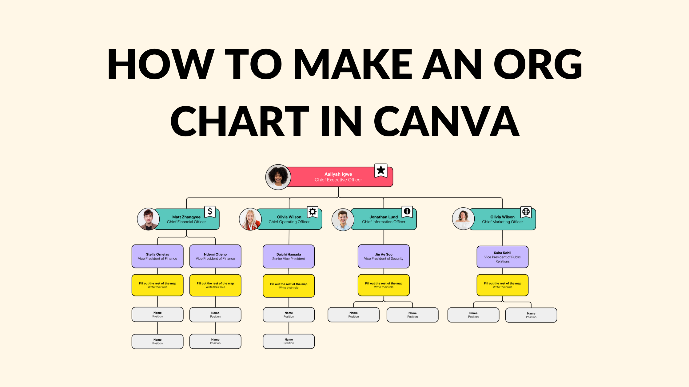
How to Create an Organizational Chart in Canva
Creating an organizational chart in Canva is a straightforward process that involves selecting the right template, adding text and images, and customizing the design. Here’s how to do it:
Choosing the Right Template
To create an organizational chart in Canva, users must first choose the right template. Canva offers a wide range of customizable templates for organizational charts, including minimalist, colorful, and modern designs. Users can select a template that best suits their needs and customize it to their liking.
Adding Text and Images
Once users have selected their template, they can start adding text and images to their organizational chart. Users can add text boxes to the chart to input names, titles, and positions, and draw connecting lines to depict reporting relationships. Users can also add images to the chart, such as headshots of team members or logos of departments.
Customizing the Design
After users have added text and images to their organizational chart, they can customize the design to make it more visually appealing. Users can experiment with fonts, color schemes, and graphics to spice up their creative org chart. Canva also offers advanced features such as interactive charts and hierarchy charts to make the chart more engaging.
Related Posts:
Sharing and Downloading Your Organizational Chart
After creating an organizational chart in Canva, you may want to share it with your team or download it for offline use. Canva offers several options for sharing and downloading your chart.
Sharing the Chart
To share your organizational chart with others, you can use Canva’s collaboration feature. First, click on the “Share” button in the top right corner of the editor. From there, you can invite team members to collaborate on the chart by entering their email addresses. You can also choose to give them editing or viewing access.
Alternatively, you can share a link to the chart by clicking on the “Copy link” button. This will generate a shareable link that you can send to anyone. Keep in mind that anyone with the link will be able to view and edit the chart, so make sure to only share it with trusted individuals.
Downloading the Chart
If you need to download your organizational chart for offline use, you can do so in several formats. First, click on the “Download” button in the top right corner of the editor. From there, you can choose to download the chart as a PNG, JPEG, PDF, or SVG file.
PNG and JPEG files are best for sharing the chart online or inserting it into a document. PDF files are best for printing the chart, while SVG files are best for editing the chart in other design software.
Related Posts:
Tips for Creating Effective Organizational Charts
Creating an organizational chart is a great way to visualize the structure of a company or organization. However, it is important to create a chart that is easily understandable and effective. Here are some tips to keep in mind when creating an organizational chart in Canva.
Keeping it Simple
One of the most important tips for creating an effective organizational chart is to keep it simple. The chart should be easy to read and understand, even for those who are not familiar with the company or organization. Avoid using too many levels or including too much information in each box. Use clear and concise language to describe each position and avoid using jargon or acronyms that may not be familiar to everyone.
Updating Regularly
Another important tip is to update the organizational chart regularly. As companies and organizations grow and change, so does the structure. It is important to ensure that the chart reflects the current structure of the company or organization. This will help prevent confusion and ensure that everyone is on the same page.
Using Colors Effectively
Finally, using colors effectively can help make the organizational chart more visually appealing and easier to read. Use colors to differentiate between levels or departments, or to highlight certain positions. However, be careful not to use too many colors or make the chart too busy.
Related Posts: