
Template Fonts is reader supported. When you buy through links on our site, we may earn an affiliate commission. Learn more
Creating a pie chart is a great way to visually represent data. With Canva’s pie chart maker, anyone can create a professional-looking chart in just a few minutes. Canva provides hundreds of pie chart templates to choose from, making it easy to create a chart that fits your specific needs.
To get started, simply select a template and customize the data and labels. Canva’s intuitive interface allows users to adjust colors, fonts, backgrounds, and more. Plus, the platform is accessible from both desktop and mobile devices, so you can create a pie chart on-the-go. Whether you’re creating a chart for a presentation or just for fun, Canva makes it easy to create a visually appealing and informative pie chart.
Understanding Canva
What is Canva?
Canva is a graphic design platform that allows users to create various types of designs, including social media graphics, presentations, posters, and more. It offers a user-friendly interface and a vast library of templates, stock photos, and illustrations. Canva is accessible through its website or mobile application and offers both free and paid versions.
Why Use Canva?
Canva is an excellent tool for those who are not graphic designers but want to create professional-looking designs. It is easy to use, and its templates and design elements make it simple to create a design quickly. Canva’s library of templates and illustrations also saves time and effort in creating designs from scratch.
Canva is also an affordable option compared to hiring a professional graphic designer. The free version of Canva offers a lot of features, and the paid version provides even more design options and features.
Getting Started with Canva
To get started with Canva, users need to create an account. The process is simple and only requires an email address or a Google or Facebook account. Once logged in, users can choose from various design types, including social media graphics, presentations, posters, and more. They can then select a template or start with a blank canvas and add design elements such as text, images, and illustrations.
Canva offers a wide range of design tools, including the ability to upload custom images, change colors and fonts, and add filters and effects. Users can also collaborate with others on designs by sharing a link or inviting them to edit the design directly.
In conclusion, Canva is an excellent tool for creating professional-looking designs, even for those who are not graphic designers. Its user-friendly interface, vast library of templates and design elements, and affordable pricing make it a popular choice for individuals and businesses alike.
Basics of Pie Charts
What is a Pie Chart?
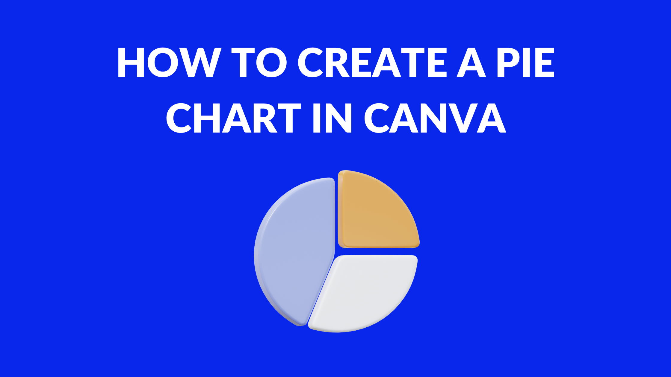
A pie chart is a circular chart that is divided into sectors to illustrate numerical proportions. Each sector represents a proportionate part of the whole, and the entire circle represents 100%. Pie charts are commonly used to represent data that can be divided into categories, such as survey results, sales figures, and demographic data.
Pie charts are an effective way to represent data visually, as they allow the viewer to quickly and easily compare the relative sizes of the different categories. They are also easy to read and understand, making them an ideal choice for presentations and reports.
When to Use a Pie Chart
Pie charts are best used when the data can be divided into categories that add up to 100%. They are particularly useful for showing the relative sizes of different categories, as well as the proportions of those categories to the whole.
Pie charts are not recommended for showing changes over time, as they are static and do not allow for easy comparison between different time periods. They are also not recommended for showing more than 5-7 categories, as too many categories can make the chart difficult to read and understand.
In summary, pie charts are a useful tool for representing data visually, particularly when the data can be divided into categories that add up to 100%. They are easy to read and understand, and allow the viewer to quickly compare the relative sizes of different categories. However, they should be used with caution, and are not recommended for showing changes over time or more than a few categories.
Creating a Pie Chart in Canva
Creating a pie chart in Canva is a straightforward process that anyone can do. With Canva’s pie chart maker, you can make a pie chart in less than a minute. Follow these simple steps to create your own pie chart.
Selecting the Pie Chart Template
To begin, open Canva and select the “Pie Chart” template from the “Charts” category. This will give you a blank pie chart with placeholders for your data. You can also choose from Canva’s hundreds of pie chart examples to make your own.
Inputting Data
Next, input your data into the placeholders. Simply click on the placeholder and type in your data. Canva will automatically update the pie chart to reflect your data. You can add as many data points as you need and Canva will adjust the size of each slice accordingly.
Customizing the Pie Chart
Once you have inputted your data, you can customize the look of your pie chart. You can change the colors, fonts, background, and more. To change the colors, click on a slice of the pie chart and select the “Color” option. From there, you can choose from Canva’s preset color palettes or create your own custom color scheme.
You can also add labels to your pie chart by clicking on a slice and selecting the “Label” option. This will add a label to the slice with the corresponding data point. You can customize the font, size, and color of the label to match your design.
In conclusion, creating a pie chart in Canva is a simple process that anyone can do. By following these steps, you can create a pie chart that is both informative and visually appealing.
Enhancing Your Pie Chart
Creating a pie chart in Canva is easy and straightforward. However, to make your pie chart stand out and convey your message effectively, you need to enhance it. Here are some tips on how to enhance your pie chart in Canva.
Adding Text
Adding text to your pie chart can help clarify the information presented. You can add a title to your chart to give context to your data. You can also add labels to the slices of your chart to show the exact values of each category. To add text to your chart, simply click on the Text button in the toolbar and choose the type of text you want to add.
Using Icons
Icons can be used to make your pie chart more visually appealing and to emphasize specific data points. For example, you can use a dollar sign icon next to the slice that represents revenue to make it more noticeable. To add icons to your chart, click on the Elements button in the toolbar and search for the icon you want to use.
Applying Color Themes
Applying a color theme to your pie chart can help make it more visually appealing and easier to understand. Canva offers a variety of color themes that you can apply to your chart with just a few clicks. To apply a color theme, click on the Background button in the toolbar and choose the color theme you want to use.
In conclusion, enhancing your pie chart in Canva can help make it more effective in conveying your message. Adding text, using icons, and applying color themes are just a few ways to enhance your chart. With these tips, you can create a pie chart that is not only informative but also visually appealing.
Sharing and Downloading Your Pie Chart
Sharing the Chart
Once you have created your pie chart in Canva, you may want to share it with others. Canva makes it easy to share your chart with others in a variety of ways.
One way to share your chart is to simply send a link to the chart. To do this, click on the “Share” button in the top right corner of the screen. From there, you can choose to share the chart via email, social media, or by copying the link and sharing it directly.
Another way to share your chart is to embed it on a website or blog. To do this, click on the “Embed” button in the top right corner of the screen. From there, you can choose the size of the chart and copy the embed code to paste into your website or blog.
Downloading the Chart
If you want to download your pie chart to use in other projects or presentations, Canva makes it easy to do so. To download your chart, simply click on the “Download” button in the top right corner of the screen.
From there, you can choose the file type you want to download the chart as, such as PNG, JPEG, or PDF. You can also choose the size and quality of the file you want to download.
Once you have made your selections, click on the “Download” button to download your chart. You can then use it in any other project or presentation as needed.
Overall, sharing and downloading your pie chart in Canva is a simple and straightforward process that can help you communicate your data effectively.